Nothing gives away now in this duplex located in a skyscraper north of Madrid that the decoration had become obsolete, with carpeted floors, gotelé on the walls, dark carpentry… The building dates from the late 70’s and also the distribution of the rooms had to be adapted to the new family needs.
The owners, a young couple with two daughters, commissioned the renewal to the architect and interior designer Mónica Diago (monicadiago.com), who followed the instructions of prioritizing the day area and opting for a modern and elegant design.
113
 © Javier Bravo for Mónica Diago
An entry with character
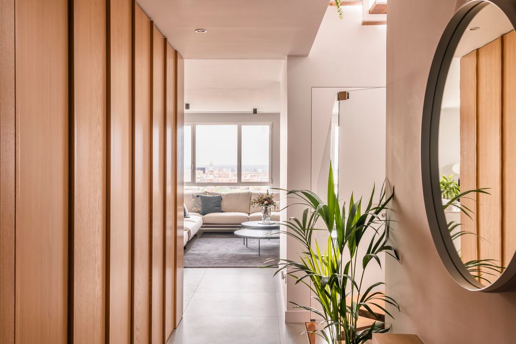
The floor adds almost 200 meters2 between the two floors, and it was cared for and in good condition, however, it needed to be updated. The comprehensive renovation above all prioritized the entry of solar rays into all roomssince the house enjoys views and light worth highlighting.
We are seeing that even the entrance has a lot of clarity. “Natural oak wood paneling was designed in aisle from the hall, which hides storage elements and a door to the kitchenbut at the same time it serves as an element that gives personality and quality to the home as soon as you enter,” Mónica highlights.
213
 © Javier Bravo for Mónica Diago
A very cozy living room
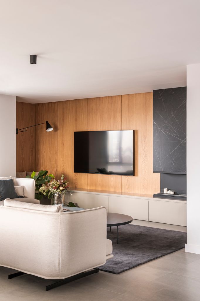
Another wooden paneling was designed in the area of loungeto maintain a unified aesthetic. Although in this case it is used as a backdrop for the sofa area. This resource, in addition to being aesthetic, is very practical since it hides all the cables and devices related to television.
“The protruding element that houses the chimney bioethanol It was covered with a material that delicately contrasts in color and texture. This choice not only contributes to the zoning of spaces, but also provides an elegant feeling of verticality. In addition, it manages to visually divide the length of the wall, creating an aesthetic balance and a more interesting dynamic,” says the architect and interior designer behind the project.
313
 © Javier Bravo for Mónica Diago
Serenity and style
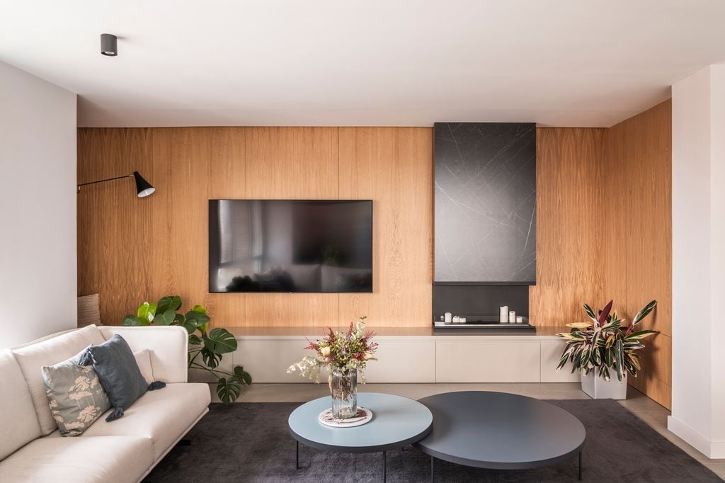
Except in the daughters’ bedroom and bathrooms, the predominant colors are neutralwith the use of grey, white and black, sober ranges that They are contrasted with the presence of the green of the plants and the wood..
The living room is equipped with the couch ‘Serene’, by Joquer (purchased at Domestico Shop), the ‘Eclipse’ coffee tables, by Stua, and a low piece of furniture that, in the corner, houses a quiet reading corner formed by the bench accompanied by cushions and the wall light with arm.
413
 © Javier Bravo for Mónica Diago
Creating ties: spaces for full coexistence
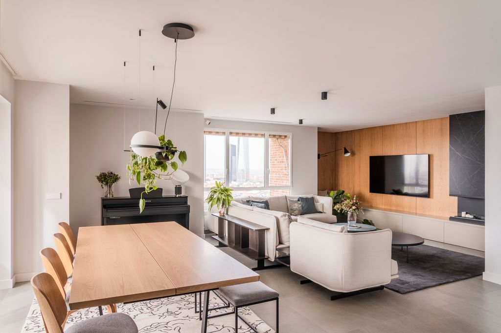
One of the family’s goals was to be able to enjoy the day area together: to have conversations or while the older ones were cooking, the little ones could be playing or reading. Here it is also common for a member to start playing the piano, since several are music fans.
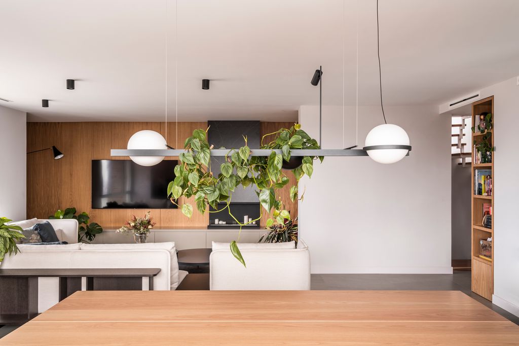
Specifically, “the entire set of dining room It is from Bo Concept, which is a brand that fits very well with the sober and elegant style of the home. In addition, it was decided change the chairs and put a bench in the area that leads to the living room so as not to create a ‘barrier’ between both environments, to connect them better”Monica details.
513
 © Javier Bravo for Mónica Diago
The triumph of biophilic design
There are many ways to remember nature, in the case of this duplex in particular it is done with the profusion of wood and integration of floors even where you least expect it. This is the case of this one, which integrated into a suspended lamp from the Vibia firm.
613
 © Javier Bravo for Mónica Diago
A generously sized kitchen
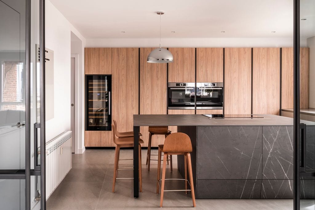
The kitchen It is semi-open to the living room and dining room, that is, a sliding glass door is used to close the space when necessary. The furniture is from Santos and the distribution is in ‘L’with one side with columns up to the ceiling in wood color, which hide many of the household appliances and, the other side, with base furniture in natural color.
In the center and as an articulator of the entire space, a large island in a dark veined porcelain that is also used for the front of all the drawers and even the plinth (which also has storage). This module, in addition to housing the induction hob, has a barwhich is accompanied by high stools from Ondarreta.
713
 © Javier Bravo for Mónica Diago
The children’s room, a shared experience
A staircase that starts from the hall leads to the night area made up of three bedrooms (one for the daughters, one for the parents and a guest room) with their own bathrooms. suite.
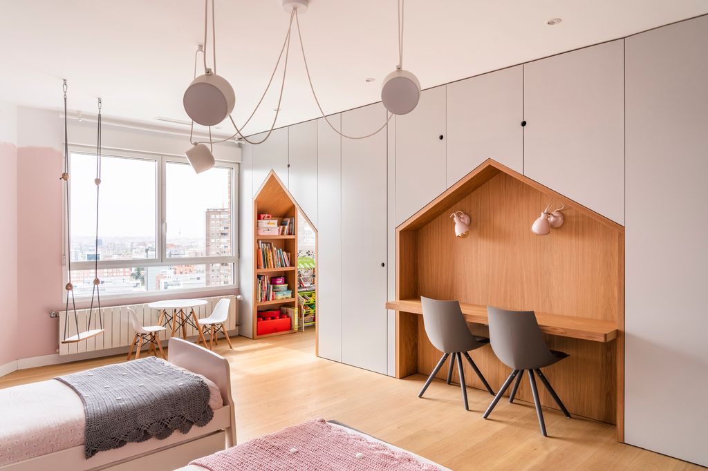
“The children’s room It is shared use between the sisters“, but it is designed leaving the possibility of separating two rooms in the future,” says Mónica, who to give personality to the room designed a piece of wood and lacquer furniture that runs along the entire wall and serves multiple functions: it contains a wardrobe and shelves of storage, a deska hidden sliding door that gives access to the bathroom and also a step to the play area.
813
 © Javier Bravo for Mónica Diago
pure fantasy
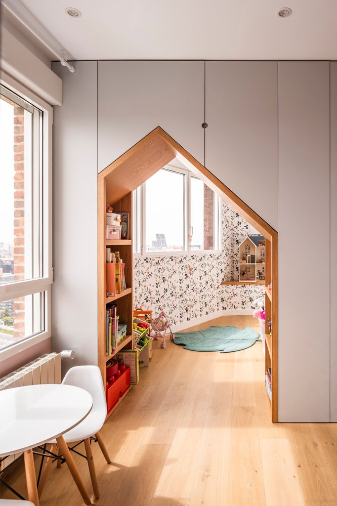
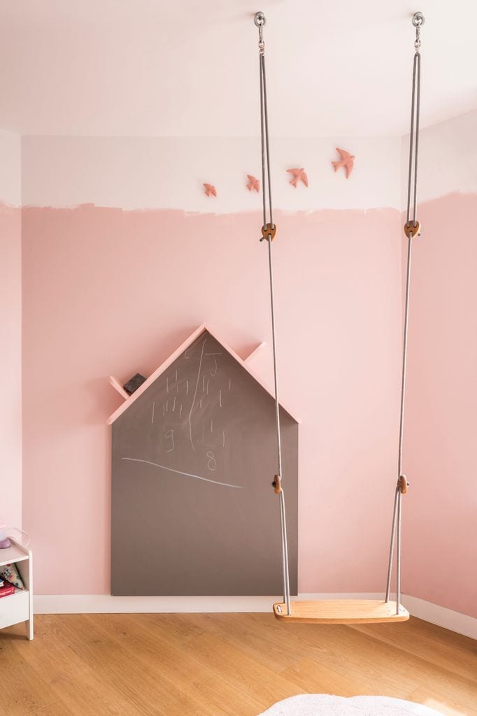
The study corner is shaped like a little house, like this access to the play area. “We wanted to treat it as if Through this ‘hole in the wall’ we passed to a totally different idyllic spacea space to play, where the infant is the true protagonist”Monica reveals.
The rug (by Lorena Canals) is perfect for the very common moments when the daughters are on the floor and, in addition, it can be put in the washing machine.
913
 © Javier Bravo for Mónica Diago
Enhance creativity
It is a bedroom so large and with so much light, that we wanted to design and create different environments, with uses other than sleeping or studying. For example, “we integrate a swing of design that was the delight of our little clients,” confesses Mónica.
The playful elements that stimulate creativity also have a presence in the slate wall (again in the shape of a little house), where you can draw or write as you please. The wall has another personal touch, with an unfinished painting effectso that it seemed that the trace had been made by the users of the room themselves.
1013
 © Javier Bravo for Mónica Diago
A children’s bath for two
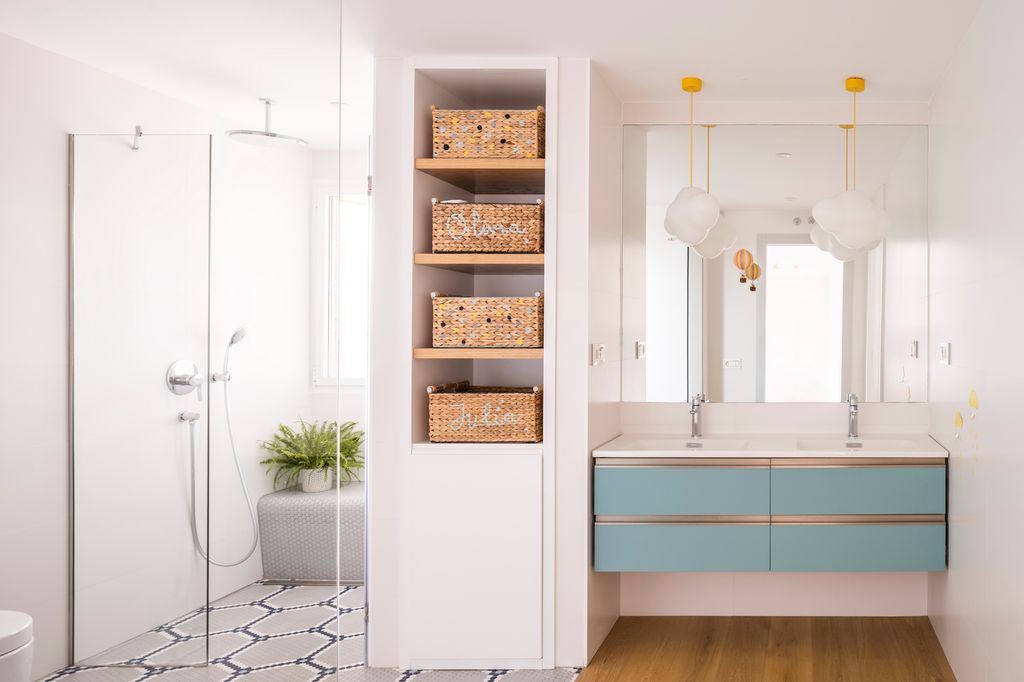
The sisters’ bathroom has been divided into two areas: courtesy It has a cantilevered cabinet, a countertop with integrated sinks, two hanging lamps and a wooden floor; while the toilet and shower area It is paved with an ecological Hisbalit mosaic, with a hypnotic beehive motif.
1113
 © Javier Bravo for Mónica Diago
A complete ‘suite’: bedroom, bathroom and dressing room
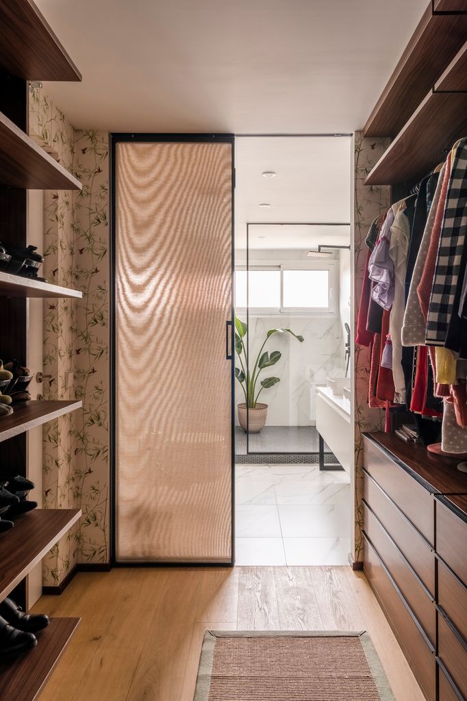
The 200 meters2 of housing allow adding a large dressing room next to the master bedroom. This is equipped with shelves and continuous drawers in the lower area and a continuous bar in the upper part, completely open to generate a greater sensation of spaciousness. Mónica explains that, in addition, “the covered glass door allows light to enter the dressing room, but also gives privacy to the space.”
1213
 © Javier Bravo for Mónica Diago
An oasis with great prominence of white
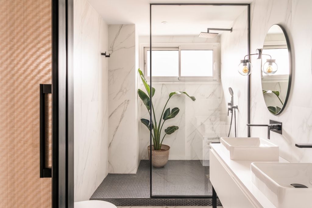
Modern in style, the bathroom It also has retro touchessuch as the wall lights, the countertop sinks and the mosaic-based shower (although in a very modern black color).
The chosen wall covering is extremely topical, a large-format marble-aesthetic porcelain tile, to minimize joints and make the grain look continuous. This ‘box’ in a white tone multiplies natural light creating a very relaxing atmosphere.
1313
 © Javier Bravo for Mónica Diago
The temple of calm
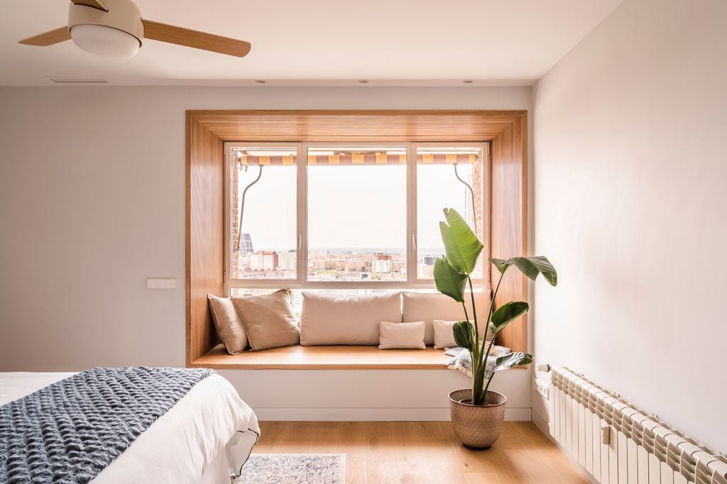
This is the master bedroomwhich brings a lot of peace by not even incorporating the wardrobe. Unusually, everything The centerpiece of the room is the window framed in oak wood with a benchwhich sets up a nice reading corner. The views from this ‘viewpoint’ in Chamartín are spectacular!
In short, Mónica Diago’s studio has ‘elevated’ the style of the home, with its renovation and high-rise interior design.
